A jaw-dropping one in eight Americans work in the healthcare industry.
So, if you work in the medical device industry, you literally have thousands of doctors, caregivers, and patients who could depend on your products.


Yet a striking majority of medical device websites are difficult to navigate, losing sales in a matter of seconds.
In fact, Dr. Leslie Kernisan touches on these issues in a recent article on the Healthcare Blog. Dr. Kernisan states that in medical device websites, there are “…often too many choices, and there’s not yet a lot of help sifting through them.”
Do you hear that? Users leave your website when they don’t know what to do.
That means sales are slipping through your fingertips if your website isn’t up to snuff.
But the solution is pretty simple:
We consolidated 10 must-haves for your medical device website to keep sales high, confusion low, and allow you to continue your invaluable service to the healthcare industry.
Here we go:
- Be Human
This may seem like a strange place to start; but at the core of your website development, it’s important to remember the visitors to your site are, in fact, humans—with concerns, needs, and emotions.
While it may be tempting to speak to doctors with jargon-laden paragraphs and throw abstract buzzwords at patients, ask yourself if the content on your site is something you could read and comprehend easily as an outsider.
Remember, if you’re speaking to different audiences (patients and doctors, for example), each should be addressed individually and equally cared for on your site; this means the tone and information you provide is presented differently.
Regardless of your audience, avoid generalizations at all cost—and cut the jargon.
Here’s an example; what would catch your attention more on the homepage of a site?
- “Streamline your practice and boost revenue with top-of-the-line equipment that has helped thousands of doctors with productivity!”
Or
- “Over 5,600 medical offices use (brand name) automated calling software. The results? Less time spent in the waiting room. Happier patients. And an increase of three additional appointments each day.”
Keep it specific.
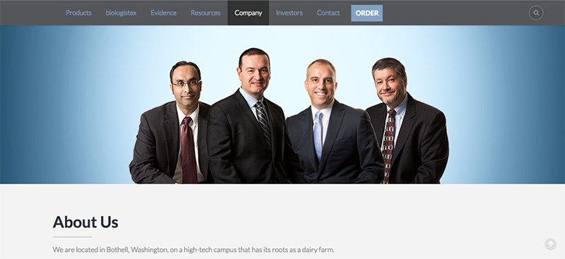

And finally, make sure you have a strong “about us” section, with a real photo of your team. BioLife Solutions does a great job of this on their about us page.
Why? Because people want to do business with other human beings—not corporations. A simple photo of who you are and an engaging voice in your writing can go a long way.
- Be Ready and Willing to Prove Concept
A truly great medical device website needs to have some level of proof of concept. A free demo is a great way to accomplish this.
If that isn’t possible, use social proof, testimonials, case studies—and make sure to provide plenty of educational resources to help them along the learning curve.
Think:
- 24-hour customer support
- Tutorial videos
- FAQ page
- Blogs that address more common, larger concerns
- Infographics, interactive photos
- Have Separate Sections for Medical Practitioners and Patients
Medical practitioners are interested in the best product to help their patients. They want proof, specific examples, and an understanding of how your product works.
It wouldn’t be appropriate to speak to doctors the way you would address an inquiring patient—because their need for the product, medical education, concerns, and questions are different.
So, separate your content for your different audiences.
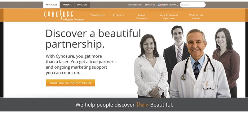

Cynosure does this masterfully, with separate pages for physicians, patients, and investors; the user selects their appropriate profile above the main navigation of the page. The page for physicians is vastly different from the patient results, with content directed at the particular audience.
On that note, when speaking to clinicians directly, make sure to address how your product will help them help patients. And use specific examples.
—Oh, and one last thing:
You must be extremely careful in your wording depending on your audience. Content that is acceptable for a doctor could be deemed misleading if put in front of a patient.
So, organizing your content by audience is not only useful for the reader—it also protects your brand from potential legal issues.
That being said, always assume your audience is intelligent and concerned; and speak to them in a way that is empathetic and breaks down (sometimes complicated) information to be consumed easily.
They’ll appreciate it.
- Provide Educational Resources: Brochures, White Papers, and eBooks
Particularly for the medical professionals who visit your site: make sure to provide educational, downloadable resources.
Doctors will appreciate the option to print a brochure for an easier reading experience—and many may even want to print the material for their patients. So, make sure the brochure PDF is print-ready (sans margins).
But don’t stop there with educational resources.
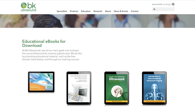

BK Ultrasound’s Educational Resources Page
Provide eBooks and white papers that not only pertain to your product, but also offer information to the medical industry it serves.
Why?
Offering all that useful, beneficial information for your audience proves your brand is dedicated to patient care—not just the profits from their doctors.
Here’s what I mean:
- Find a common pain point for your target audience.
In the ophthalmic industry, for example, many eye care professionals struggle with back pain due to the physical demands of eye exams.
- Write, design, and publish an eBook to your site that offers tangible solutions to negate these issues.
As mentioned, ophthalmic instrument providers have a large clientele struggling with back problems. So, these providers should offer an eBook with solutions for reducing back pain, such as routine stretching, office setup, and early signs of injury—and also touch on how choosing the right instruments (i.e., theirs) is a part of that solution.
- Blogs
Use them.
And not just for product promotion. You have an opportunity to address the interests, concerns, questions and relevant topics of your target audience on a regular basis. The more value you provide on your site, the more your audience will trust you and commit to your product.
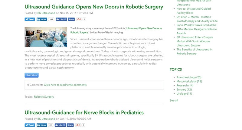

BK Ultrasound’s Blog Page
Make them want to visit your site again and again—even if they don’t need to upgrade their equipment.
- Have a Clinical Evidence Section
Imagine a doctor is asked by a patient, “is (your product) a good option for me to use?”
Your job is to give that doctor the proof he or she needs to answer that question with an enthusiastic “yes.”
Doctors want proof—data-driven, evidence-based, clinical studies—of how your product will help their patients. Don’t make them trudge through the literature themselves. Provide easy-to-find clinical evidence that supports your product.
Also, make sure to disclose the accuracy of the collected data.
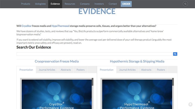

BioLife Solutions’ Evidence Page
Remember, this clinical evidence is critical—but you can still keep it human. Include parts of the abstracts and data points, but most importantly, highlight the information you want the physician to see.
Make it easy for them to find and read.
- Intuitive Navigation and a Strong Homepage
When a medical practitioner visits your site, what does he or she look for first? How about a patient?
Get into the mind of your audience and make is as easy as possible to get where they want to go from the home page.
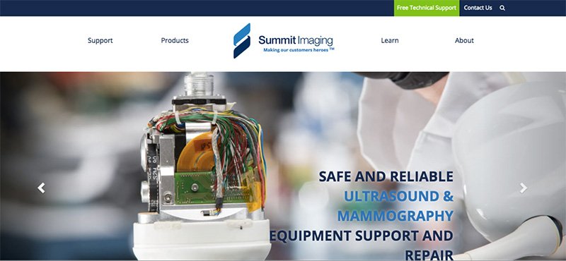

Summit Imaging does a great job of customizing its navigation bar to its customers’ most prevalent needs, with a “support” button on the top of the page—clearly a popular destination for their visitors. Summit Imaging also has its products organized by manufacturer and field category.
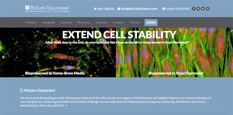

Similarly, BioLife Solutions has a quick and easy “order” button on the top of the homepage for returning customers who know what they want.
Beyond convenience, visitors who stumble onto your page should know in a matter of seconds who you are and what you do. Include:
- Large, high-resolution photos of your device being used in its clinical environment
- A short explanation of your product that is easy to read (think very short sentences)
- Blurbs of your product’s benefits for the patient and doctor
You want anyone who lands on your page—doctor, patient, or lost internet surfer—to immediately understand what you do and why it’s so incredible.
- Product Benefits
This is worth repeating.
On your homepage, on your clinical evidence page, in your product descriptions, you need to make it very clear why your product will help doctors help their patients.
Keep it concise. Use plain English. Give examples. How is your product different and better than similar products?
- Organize Products Thoughtfully
Are you sensing a pattern of importance here?
* Hint: Organization! *
You can have the best photos, writing, videos, and information on the world-wide web about your product, but if you don’t organize it well—it’s all for naught.
Thought needs to be put into the organization of the site based upon the needs of the target. Think of it this way:
- Do you distribute products from multiple manufacturers?
- Are certain products synergistic in their application?
- Are your products field-specific?
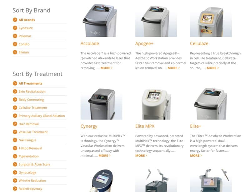

Check out Cynosure’s product page for physicians. Doctors can browse their products by the brands Cynosure offers, or by treatment.
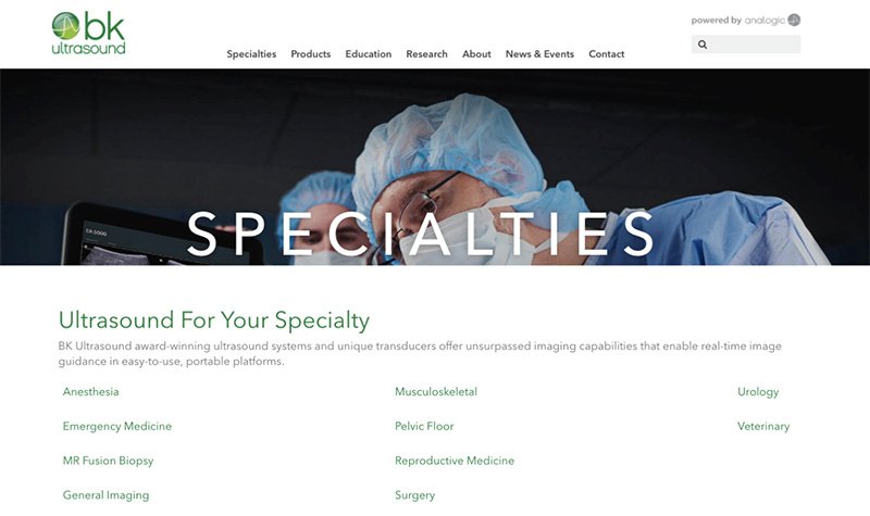

BK Ultrasound also has a stellar way of organizing their products by specialty. For example, a doctor who needs an ultrasound system for anesthesia will never have to sift through systems for urology. Instead, he or she can filter the products to his or her field exclusively.
- Have a How-to Section and Always Use High-Quality Photos
Using separate sections for medical practitioners and patients as necessary, make sure you have a “how-to” / “how-it-works” page.
Be descriptive and use photos to aid your explanations.
In fact, high-quality photos should be used throughout your site altogether. Remember, these images should show your product being used in a real setting.
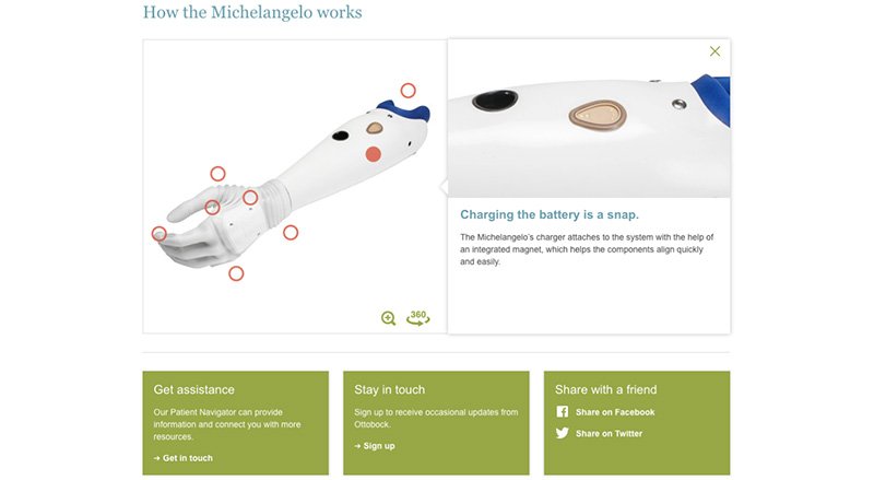

Ottobock masters the “how it works” section with an interactive, high-quality photo on their homepage of their product, the Michelangelo.
The Secret
I know I just gave you a lot of feedback to work with. But there’s a secret to keep in mind when creating the best possible website for medical devices:
- Keep it simple
- Keep it visual
- Keep it honest and direct
Ultimately, your audience values a website that almost tells them what to do.
Make sure no matter where you guide them, the content is easy to digest, visually interesting, and supports your product with research-based evidence.
If you’re not sure where to start now—I don’t blame you. In your thriving industry, even great websites have a hard time standing out.
But, look, Solutions 8 actually specializes in digital marketing for medical device businesses (we even have articles that help medical device manufacturers specifically with their digital marketing).
That means we build and fill websites with these top 10 must-haves—and so, so much more.
So, whether you need a whole lot of help, or just some guidance:
Author
Patience is the former director of marketing and communications for Solutions 8. A phenomenal content writer, copywriter, editor, and marketer, she has played a prominent role in helping Solutions 8 become an authority in the Google Ads space. Patience is also the co-author of The Ultimate Guide to Choosing the Best Google Ads Agency and You vs Google.


