How many images should I use?
Should I add text on my images?
Where can I find examples of image assets?
We get these questions from our clients all the time.
That’s why in this post, we’re going to cover some of the frequently asked questions about image assets for Performance Max.
Let’s dive right in!
Image Size and Quantity
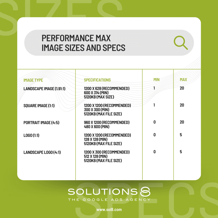
Performance Max uses Smart Display sizes, so it’s best to use landscape and square images.
For landscape images, we recommend using 1200 X 628. For square images, we recommend 1080 X 1080.
You’ll notice they’re twice the size of Google’s minimum requirements. Here’s why.
Larger size, better quality. Plus, you can also use those images on your social ads––on Facebook and Instagram.
Also, make sure that you upload as many images as you can. Right now, you can upload up to 20 images per campaign.
If this changes in the future, we still recommend maximizing your image inventory. Remember, Performance Max is going to favor massive media creation.
Having more assets has a direct impact on your success with Performance Max.
Image Text
With Facebook Ads, your ad is usually the only thing that a user sees. This means they’re focused exactly on your ad.
But with Google Ads, your ads can be displayed right beside a video (or whatever content the user is consuming). In other words, an image without a text won’t do the trick.
By adding text on your image, you’ll increase the chances of grabbing and retaining your users attention. So we highly recommend adding texts or copy to your ad.
Your copy will depend on a couple of things.
First, do you have a B2B or B2C model?
Second, are you looking to create or harvest demand?
Knowing the answer to these questions can help you create better copy. You can use the copy to attract the customers you want and push away those you don’t.
Tips on Adding Image Texts for B2C
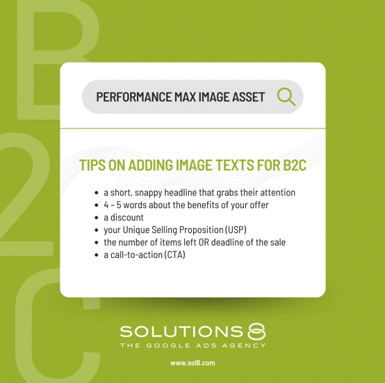
Let’s say you’re a boutique store selling women’s apparel. You might want to include the following details in your image:
- a short, snappy headline that grabs their attention
- 4 – 5 words about the benefits of your offer
- a discount
- your Unique Selling Proposition (USP)
- the number of items left OR deadline of the sale
- a call-to-action (CTA)
Remember, your text should always provide the benefits of your product. If you’re having a hard time showing the benefits, download our Quick and Easy Guide to Turn Features into Benefits.
Tips on Adding Image Texts for B2B
Now, what if you have a B2B model? Since your target is businesses, you might want to filter out consumers from clicking your ads.
Here are a few ways to do that:
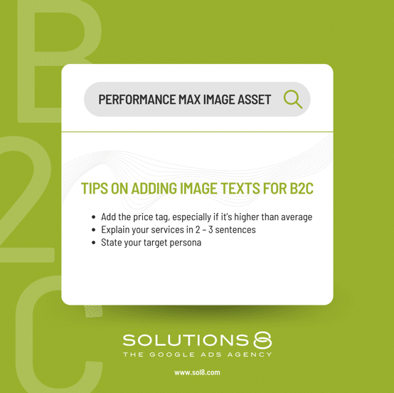
- Add the price tag, especially if it’s higher than average
- Explain your services in 2 – 3 sentences
- State your target persona
When done right, consumers will immediately know it’s not for them and ignore your ad.
Need Examples to Get Inspiration and Ideas From?
If you’re running out of ideas on how to create image assets for your business, the simplest solution is to look at your competitors’ ads.
Check out some ads in Facebook’s Ad Library.
- Go to Facebook’s Ad Library.
- Choose a location, ad category, and search for your competitors’ name.

- Browse through the results. Look for patterns.
Pro tip: Look for ads that were published a few months back and are still active.
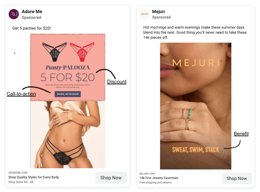
Do this to at least five of your competitors. Soon enough, you’ll have some ideas to help you create better image assets for your ads.
Author
Patience is the former director of marketing and communications for Solutions 8. A phenomenal content writer, copywriter, editor, and marketer, she has played a prominent role in helping Solutions 8 become an authority in the Google Ads space. Patience is also the co-author of The Ultimate Guide to Choosing the Best Google Ads Agency and You vs Google.
 Patience Hurlburt-Lawton