 Liz Moorehead
A good landing page has two jobs:
- Soft marketing version: Make the right visitor to feel like they’ve landed in the right place, and don’t make it hard for them to do what they want to do.
- Blunt just-between-us-girls version: Get your ideal customers to do the thing you want them to do.
I know, I’m totally blowing your mind right now with this revolutionary commentary.
And yet…
And freakin’ yet, somehow, we keep churning out landing pages I like to refer to as “camels.” Meaning they’re horses designed by committee.
Sure, you started out with clear goals and a vision, and then everyone started chiming in with their “big ideas” and competing priorities. Now, when someone clicks on your ad — say, for a “custom dining room table” — they land on a generic page with a hero image of a smiling couple holding coffee mugs near a potted plant. There’s a vague, aspirational headline about “creating the home of your dreams,” because someone wanted to make sure potential customers knew you do more than dining room tables.
This is where your money and your paid ads traffic go to die.
It’s also where your organic traffic drives off a cliff.
Because, in both cases, a landing page that leads everywhere basically leads nowhere.
You don’t want this, right?
Of course you don’t, and I don’t want it for you. Which is why we’re here today.
 Go deeper: Landing page optimization strategies to increase conversions (a practical, data-driven guide)
Which attributes describe a good landing page experience?
The short answer is relevance, speed, clarity, trust, easy navigation, mobile usability, message match, useful content, and a clear next step. But the short answer isn’t enough. Because a good landing page experience isn’t about making the page “pretty.” Pretty is nice. Pretty is welcome. Pretty can stay. But pretty without usefulness is just a beautifully decorated hallway with no doors.
For Google Ads specifically, landing page experience is part of your Quality Score, along with expected clickthrough rate (CTR) and ad relevance. Google evaluates how useful and relevant the landing page is for the person who clicked. Search also keeps moving toward better page experience signals, including loading performance, responsiveness, and visual stability.
Translation: your landing page has to serve the searcher, the ad, the business, and the device they’re using.
No pressure! Just, you know… the entire post-click experience.
OK, I see you reaching for the phone to call your therapist, so let’s break down the attributes that actually make a landing page good together.
1. A good landing page matches the promise of the ad (relevance)
The first attribute is relevance. This is the big one. In fact, if you don’t nail this, it doesn’t matter if you knock it out of the park with everything else on this list.
If the landing page doesn’t deliver a relevant experience that meets the expectations you set with your ad, you’re done.
For example, if a potential buyer clicks a paid search ad about “emergency plumbing repair,” the landing page shouldn’t drop them onto a homepage where they have to click through “Services,” then “Residential,” then “Plumbing,” then “Pipe Situations,” because apparently we’re all solving a tiny cursed maze now.
Go deeper: Is there such a thing as too many keywords with Google Ads? (benchmarks + examples)
I understand that someone else on your team might want to make sure that visitors know you do “so, so much more” than emergency plumbing repair. But those visitors are showing up with a very specific need in mind.
You know this, because you’re targeting the very specific keyword that aligns with that very specific need.
So, if you drop them off on a landing page that’s the equivalent of a tiny, cursed maze, trying to upsell them on everything all at once, they’re going to hate you.
And then they’re going to leave.
And then they’re going to buy those services from one of your competitors.
This is going to sound mean, but I need you to hear me when I say this:
- Your potential buyer does not care about you.
- Your potential buyer does not have the patience to sit around and sift through all of your “features, benefits, and capabilities” to find the one thing they were looking for.
They only care about three things:
- Themselves
- Their needs
- Finding what they want as quickly as possible
So, when I say you need to nail landing page relevance, I’m not talking about what’s relevant to you, I’m talking about what’s relevant to your potential buyers. They are the only judge, jury, and executioner, in terms of deciding what is and is not relevant.
That means a strong landing page creates immediate message match between the search, the ad, and the page. The headline should confirm the visitor is in the right place. The opening copy should speak to the same problem or desire that got the click. The offer should line up with what the ad promised.
As an ecommerce brand, organic search is still a big player in helping your category pages, product pages, buying guides, comparisons, review content, problem-solving content, and branded or non-branded queries rank.
Go deeper: 8 landing page best practices to increase conversions (+ video)
And for your paid ads… you know what I’m about to tell you.
If your ad says “Get a free quote for custom closets,” the landing page should make the free quote obvious. If the keyword is “best ergonomic office chair for back pain,” the landing page should address back support, ergonomics, product fit, reviews, price, and why this chair deserves to be in the running. If the ad mentions a sale, the sale should appear on the page before someone starts questioning their life choices.
People are impatient after the click. They don’t want to re-orient themselves. They want confirmation: “Yes, this is what I clicked for. Yes, this page understands what I need. Yes, I can keep going.”
It’s that (annoyingly) simple.
2. A good landing page loads fast enough that nobody starts spiritually leaving (page speed)
I really hope this isn’t brand new information to you, because I was standing on stage in front of 600 leaders at a marketing conference in 2017 talking about page speed. And then again in 2020 and 2021, when Google’s Core Web Vitals first rolled out.
Back then, I would say things like:
“Sorry, marketers. Speed is no longer that ‘technical thing’ you can toss over to the web team, because it’s not really that big of a deal.”
Today, I’m going to tell you:
“You know speed is everything, because you know how pissed off you get as a consumer the moment a page takes more than 2 seconds to load. Why would your customers be any different from you?”
Go deeper: How to find negative keywords for Google Ads campaigns (+ examples)
If I put my armchair psychologist tweed blazer on, I think sometimes we like to pretend things get “too technical” or aren’t “that big of a deal” with things like page speed because we’re kind of annoyed at how much more complex our job has become over the past 12 years with websites and landing pages.
I’m not saying that to lecture you. Trust me, I feel the exact same way.
“Oh, look. Now that I have this landing page exactly how I want it, I’m getting optimization errors: the page is taking too long to load, pictures are too large… and what the actual f*ck is schema markup again?”
But to quote modern day philosopher, Hyman Roth:

Yes, our jobs are harder, but we can do it.
So, let’s talk about Google’s Core Web Vitals: your website speed dashboard.
Google’s Core Web Vitals focuses on three parts of the experience: how fast the main content loads, how quickly the page responds when someone interacts, and whether the layout stays stable while loading.
But, of course, Google uses technical terms for each:
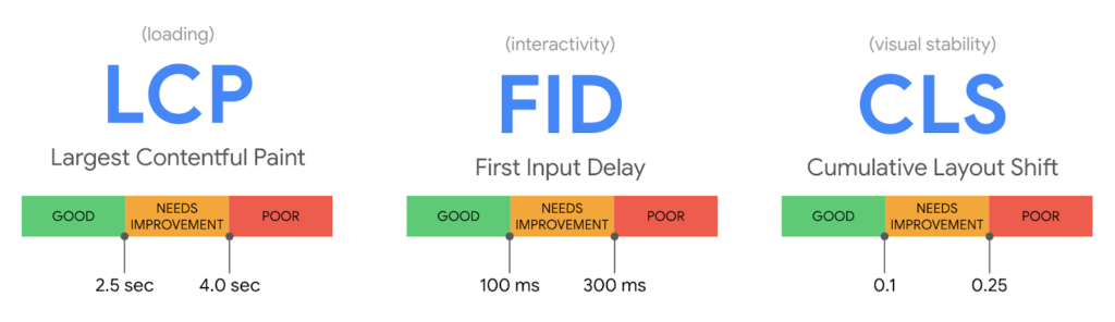
The current targets are a Largest Contentful Paint (main content load) under 2.5 seconds, an Interaction to Next Paint (interactive page response) under 100 milliseconds, and a Cumulative Layout Shift (layout stability) score under 0.1. In normal-human language: load the important stuff quickly, respond when people tap things, and stop making buttons jump around like they’re being hunted.
Go deeper: Branded keywords vs. non-branded keywords, and what each tells you about growth (+ examples)
Speed also has real commercial consequences.
A one-second mobile delay can affect mobile conversions by up to 20%. In ecommerce, the highest conversion rates tend to happen when pages load in one to two seconds, with conversion rates dropping as load time increases.
This is why the words “the landing page is beautiful once it loads” should never, ever cross your lips. If the page takes too long, your visitor may never see the beauty. They’ll just leave and buy from the uglier, faster competitor, which feels unfair until you remember the customer doesn’t owe anyone patience.
3. A good landing page is built for mobile, because that’s where the humans are
OK, this is usually true, but you need to validate where your users are with actual data, and what devices they’re using.
For example, right now, I have a client that has an average site traffic breakdown of 75% desktop, and 25% mobile. Sounds insane, right? But then there’s the context behind that data: they’re a B2B company with customers in highly regulated industries. Those B2B leads are typically doing their research at work, during business hours, at their desk.
Yes, they still need to make sure that mobile experience is locked down (which we’re about to discuss), but they need to remember they’ve got a desktop-first audience.
On the other hand, another client I work with (B2C luxury goods) is 85% mobile and 15% desktop. If they aren’t going mobile-first with their approach, their business will die.
Go deeper: How to do a PPC audit the right way (process + examples)
That’s why a good landing page works on mobile without making people perform tiny finger surgery.
That means:
- The headline is readable.
- The buttons are easy to tap.
- Forms don’t feel like paperwork from a haunted DMV.
- Product images load properly.
- The page doesn’t require pinching, zooming, scrolling sideways, or guessing which microscopic icon will reveal the shipping cost.
Mobile landing page experience matters because mobile users are often in a high-friction environment already.
They’re on a couch, in a parking lot, between meetings, pretending to watch TV with their family, or standing in the kitchen waiting for the air fryer to beep. They’re interested enough to click, but that interest is fragile.
A bad mobile experience gives them permission to leave.
4. A good landing page makes the next step painfully obvious
A strong landing page doesn’t make people wonder what to do next.
You make that next step clear.
That could be “Buy now,” “Get a quote,” “Book a consultation,” “Start a trial,” “Shop the collection,” “Download the guide,” or “Compare plans.” The exact CTA depends on the offer and the stage of intent. But the page needs one clear primary action.
On top of that, you can’t bury that one CTA to rule them all under a bunch of other competing options.
I understand you want them to subscribe to your newsletter. I understand want them to explore other options. I understand you’re desperately afraid that if they don’t want to smash that one button you want them to smash immediately, and you give them no other options, they’ll abandon you forever.
Take a breath.
Resist the impulse.
Go deeper: How much are Google Ads for ecommerce? (budget + pricing guide)
A good landing page can support secondary actions, especially for higher-consideration offers, but the primary path should be clear. If the visitor is ready, they should know what to do. If they’re almost ready, the page should help them get there.
5. A good landing page answers the questions people bring with them
People don’t land on your page as blank little conversion babies.
They arrive with context, expectations, doubts, and questions:
- How much does this cost?
- Is it right for me?
- Can I trust this company?
- What happens after I fill out the form?
- How long does shipping take?
- What if it doesn’t fit?
- Is this better than the other option I was just looking at?
- Why is there a stock photo of a man in a headset pointing at a chart like he’s solving international grain policy?
A good landing page anticipates the real buying questions and answers them before anxiety turns into exit intent.
For ecommerce, that may include price, product details, sizing, materials, shipping, delivery timing, return policy, reviews, comparison points, guarantees, and payment options. For lead generation, that may include who the service is for, what the process looks like, what the visitor gets, how long it takes, what happens after submission, and whether the company is credible.
 Case study: How The Foot Doc achieved lead gen goals through strategic campaign optimization
This is especially important because recent ecommerce UX research still shows major gaps in product page performance. Many leading ecommerce sites have mediocre or worse product page UX, and mobile product pages perform even worse. That’s wild when you consider product pages are where nearly every shopper goes before deciding whether to buy.
Your landing page should not assume the visitor will hunt for the answer. If the question affects conversion, bring the answer closer to the decision.
6. A good landing page feels trustworthy before it asks for anything
Trust is part of landing page experience. If the page looks sketchy, vague, outdated, or weirdly evasive, people notice. They may not say, “Ah yes, I’m experiencing a deficit of commercial trust signals.” They’ll just get a bad feeling and leave.
Trust comes from a lot of small signals working together: specific copy, clear pricing or offer details, real reviews, recognizable logos, security indicators, transparent policies, accurate product information, easy-to-find contact details, and proof that a real company exists behind the page.
This matters even more near checkout.
Recent cart abandonment data shows shoppers still bail over issues like high extra costs, slow delivery, lack of trust with credit card information, forced account creation, complicated checkout, unsatisfactory return policies, site errors, and hidden total costs.
Go deeper: Landing page optimization strategies to increase conversions (a practical, data-driven guide)
In other words, people don’t abandon only because they “changed their mind.” Sometimes the page gave them 14 reasons to reconsider, then acted surprised when they did.
A good landing page reduces suspicion. It explains what matters. It doesn’t bury the ugly-but-important details. Shipping, returns, guarantees, privacy, total cost, next steps, and payment options should be easy to find before the visitor starts mentally backing away.
7. A good landing page is easy to navigate without becoming a full website
Landing pages are often treated like they should trap the visitor in a conversion terrarium. Remove the navigation! Hide the exits! Force the form! Growth!
Please stop letting panic design your pages.
For some campaign types, a focused landing page with minimal navigation makes sense. But a good landing page still has to be usable. People should be able to find what they need, move through the page logically, and understand where they are. Google has also put more emphasis on relevant content and easy-to-navigate landing pages for search ads.
Go deeper: What are buyer intent keywords and how do you use them? (+ examples)
Navigation doesn’t always mean a full top menu. It can mean jump links, clear sections, sticky CTAs, product tabs, comparison tables, filters, breadcrumbs, or an obvious path back to the broader site. The point is that the page should support the visitor’s decision process instead of holding them hostage.
If someone needs reviews before buying, make reviews easy to reach. If they need specs, show specs. If they need pricing, don’t make them solve a riddle. If they need to compare options, give them a comparison. People who can’t find what they need rarely reward you for the mystery.
8. A good landing page has a strong visual hierarchy
Visual hierarchy is the difference between “this page is easy to scan” and “my eyes have filed a workers’ comp claim.”
A good landing page helps people understand what matters first, second, and third. The headline carries the main message. The subhead adds context. The imagery supports the offer. The CTA stands out. Sections are arranged in a logical order. Important details don’t get buried under decorative fluff.
This matters because people scan before they commit. They’re looking for cues that the page is relevant, credible, and worth their time. If every element screams equally, nothing is heard. If the page has giant lifestyle images but hides the product value, you’ve made a mood board with a budget.
Go deeper: How to increase traffic with Google Ads (data-driven tactics + examples)
Good visual hierarchy makes the page feel easier before the visitor reads a word. And “this feels easy” is one of the most underrated conversion assets on the internet.
9. A good landing page removes form and checkout friction
Forms and checkout flows are where interest goes to be tested. Sometimes the visitor passes. Sometimes the page gets greedy and ruins everything.
A good landing page asks for what it needs and earns the rest later. If someone is downloading a simple guide, you probably don’t need their company revenue, blood type, and earliest childhood memory. If someone is requesting a high-value consultation, you can ask more qualifying questions, but the form still needs to feel proportional to the value of the offer.
For ecommerce, checkout friction is often more expensive than teams want to admit. Forced account creation, hidden costs, limited payment options, weak error handling, and long checkout processes all push people away. A landing page experience doesn’t end at the first CTA click. If the page gets someone interested and the next step falls apart, the experience is still bad.
The test is simple: does each field, step, or requirement help the visitor complete the action, or does it mostly make your internal reporting feel prettier?
Be honest. The CRM will survive.
10. A good landing page connects to the business goal, not vanity metrics
A landing page can have a beautiful design, a strong scroll depth, and a conversion rate that looks decent in isolation while still attracting the wrong people. This is where marketers need to stay awake.
A good landing page experience supports the business outcome behind the campaign. For paid search, that means the page should align with the keyword intent, ad promise, campaign goal, and conversion quality. If the campaign is meant to generate qualified leads, the page should not be optimized purely for form volume. If the campaign is meant to sell profitable products, the page should not drive discounted, low-margin chaos and call it a win.
Go deeper: Landing page optimization strategies to increase conversions (a practical, data-driven guide)
Landing page experience is not only about whether someone converts. It’s about whether the right person takes the right action with the right expectation.
That means you should look beyond surface-level conversion rate. Watch lead quality, sales acceptance, close rate, revenue, return rate, AOV, CAC, ROAS, and customer value. A page that generates fewer but better conversions may be doing more for the business than a page that attracts every bored clicker with a pulse and an email address.
So, which attributes describe a good landing page experience?
A good landing page experience is relevant, fast, mobile-friendly, clear, trustworthy, easy to navigate, visually organized, useful, low-friction, and aligned with the campaign’s business goal.
More simply: it keeps the promise that got the click.
The page should load quickly, match the ad, answer the visitor’s real questions, make the next step obvious, and remove the little doubts that keep people from moving forward. It should feel like a helpful continuation of the search, not a bait-and-switch, a scavenger hunt, or a glossy brochure that forgot to sell anything.
Because paid traffic is expensive enough before your landing page starts acting like a conversion moat.
If you’re sending people to a page that’s slow, vague, cluttered, generic, untrustworthy, or disconnected from the ad, you’re not giving the campaign a fair shot. You’re paying for the click, then making the visitor work too hard after they arrive.
A good landing page doesn’t do that. It respects the click. It respects the intent behind the click. And, ideally, it helps turn more of that traffic into something the business can actually use.
If you have specific questions about getting more ROI from your paid ad strategy, connect with the Solutions 8 team. We can help you figure out whether your landing pages are supporting your campaigns, quietly sabotaging them, or sitting somewhere in the uncomfortable middle where most expensive problems like to live.